The Art in Music: Album Artwork

In a collaboration between Exeposé Music and Arts & Lit sections, Tom Bosher and Yudy Wu look at iconic album covers
Tom Bosher looks at a variety of album art work from different genres over time.
I remember the old days of iTunes where you could scroll through your albums in a gloss-black mirror-finish void like a finely curated gallery. The generation before might say how they remember flicking through the vinyls in the record store. I won’t comment on cassette tapes. You can’t really do much of that in today’s streaming-service-saturated world. But whether you’re a vinyl collector, CD hoarder, or a digital-music harlot who’s banished all physical formats, we can all appreciate spectacular album covers.
To start with, record packaging was pretty puritanical; brown paper packaging tied up with string. It wasn’t until 1938 that Columbia records hired Alexander Steinweiss as an art director, initiating the idea of cover art which became a major success. Now that we’ve covered the birth of image combined with the physical formats of music, let’s have the death of it.
Kanye West – Yeezus (2013)
A sharp contrast to West’s previous album My Beautiful Dark Twisted Fantasy using excessive amounts of artwork, there was a clear determinance for a minimalist aesthetic and style for the album to mirror its barebones production, explaining the use of a CD in a clear case sealed with a piece of red tape. An album described by West as ‘a protest against music’, the cover represents the death of CD. It’s an open casket for the compact disc.
The Velvet Underground – The Velvet Underground & Nico (1967)
Early versions of the album asked the owner to “Peel slowly and see”, upon which they’d reveal a flesh-coloured banana beneath. The additional costs of manufacturing the vinyl were made with the assumption that the ties to Warhol would improve sales. They did.
The 1975 – A Brief Inquiry into Online Relationships (2018)
Somewhat resembling the Beatles’ White Album, this cover is sparse. Minimal, coloured blips flecked across the cover and the small but blatant capitalised Helvetica, one of my favourites (can you tell I’m a font nerd) to let us know the band and album title. To me this cover highlights space, the contemporary space we’re in with technology and society and how we all relate to it all, or don’t.
Pink Floyd – Dark Side of the Moon (1973)
This cover was designed by Aubrey Powell and Storm Thorgerson who had limitless creative freedom, Pink Floyd giving them minimal creative direction. Richard Wright suggested them to “do something clean, elegant and graphic”. I think they nailed it.
Bombay Bicycle Club – I Had The Blues But I Shook Them Loose (2009)
Joseph Sterling made his name photographing teenagers during the late ‘50s with his collection ‘The Age Of Adolescence’ capturing the period’s hedonism and experimentation. Sterling said “the world of the adolescent is totally interlaced within itself and incapable of freeing itself… It whirls, rolls, and engulfs what it is allowed to engulf.” Talk about teen angst. But angst is exactly what I had when I fell in love on this album (and its cover).

David Bowie – Hunky Dory (1971)
The artwork was designed by George Underwood, funnily the same friend who punched Bowie in the eye at school, causing the pigmentation to alter, leaving one blue and one green iris. Who says violence doesn’t pay?
The Notorious B.I.G. – Ready to Die (1994)
The perfect contradiction of a baby with the words ‘Ready to die’ plastered underneath speaks for itself. Biggie Smalls picked a baby resembling himself to star on the cover of his debut, reflecting the album’s autobiographic nature, beginning with childhood and ending with death.
Frank Ocean – Blonde (2016)
We’re presented with a phone-like 4:3 aspect ratio image of Frank, with a hand-covered face. With a bold futura font to die for, barcode and Explicit Content sticker, this sets a bar for minimalist album covers. A true modern classic.
Fleetwood Mac – Rumours (1977)
Stevie Nicks and Mick Fleetwood spread over a stool with wooden balls proudly hanging between Fleetwood’s legs. These balls were already a staple of his stage get-up and were in fact toilet chains nicked from a club the band had played.
Kendrick Lamar – DAMN (2017)
Excellent photographic composition with another bold font choice. The designer Vlad Sepetov commented how, in not being as blatantly political as the To Pimp A Butterfly cover, he still wanted to make something loud and abrasive for Kendrick, to recognise the value in making something that didn’t fit the mould.

The Beatles – Sgt Pepper’s Lonely Hearts Club Band (1967)
In contrast to most of my other picks, this cover is distinctly not minimalist, with 88 photo-montaged characters representing the Beatles’ interests and influences, juxtaposing high-brow thinkers like Karl Marx with pop icons such as Marilyn Monroe. This contrast conveys the break-down and mixing of high and low culture which the Beatles exemplified. Designed by Peter Blake and the band, it’s a piece of art aware of its commercial nature; it asks us to recognise both the process and manufacturing of art, which (especially in the case of music) plays the part of a commodity and an aesthetic object. Music is mediated by the visual, and as video-essayist Nerdwriter points out, The Beatles are on this record three times: once as wax figures of the mop-top band they were, again as the still fake but colourful Sgt. Pepper’s Band, and finally as the real Beatles, represented not even on the cover, but as an ode to what is true for all music. It’s invisible.
Yudy Wu looks at Sevdaliza’s album covers made with digital artist Hirab Sab
All the “cool” alternative musicians have a muse in visual art – creating their album cover, music videos, and even crafting the whole visual concept of their albums. It’s Björk with Inez and Vinoodh, it’s FKA Twigs with Matthew Stones, and it’s Sevdaliza with Hirad Sab.
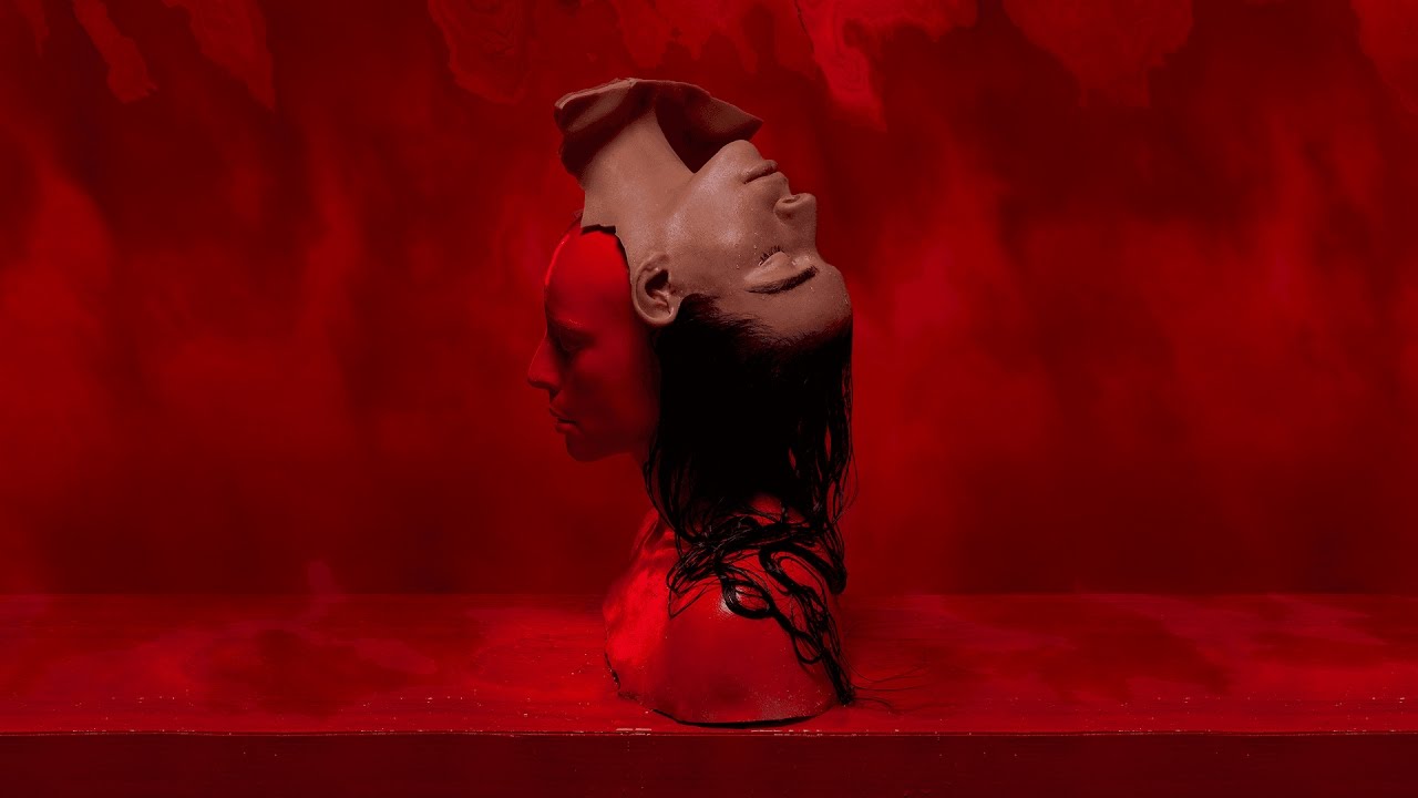
Children of Silk was Sevdaliza’s second EP (if you don’t count that one that she had deleted all over the internet); it’s the start of her magical, mellow world. There are no extreme emotions in the songs, and if I were to generalise all the stories told, it would be people who cannot recognise themselves after being unable to get what they want. It feels more than just the sadness in one’s love life; it’s all the pain and doubt in individuality – suffering from the withdraw of love, while barely knowing what they want.
From eyes to ears, Hirad Sab and Sevdaliza are the perfect duo, unfolding Sevdaliza’s world in a way that can be easily interpreted
The album cover has the same energy – humans on the cover don’t have gender as they don’t have a body that looks explicitly muscular or feminine, they seem surreal, or someone just pressed “default” on them. They do look slightly different, but they all have the same facial expression, which made them look emotionless. They are exactly like those people in the songs – there’s no actual explanation of who they are because it simply doesn’t matter; their meaning and existence were wiped away by the emotion that came with the defeat in their life. They were put into this world full of flesh-colored roses, inside of silk (or water.) It’s a sophisticated-looking world, with the cheesiest representation of love and emotion.
Their motion is something that I find fascinating: some sitting, seeming laid back; while some of them were either chasing a rose on the top or trying to escape from this world of silk. Surely there might be many same roses in this world, and chasing after, fighting over that rose don’t give themselves any meanings – but that’s an accurate representation of the stories in this album. Love itself could be a boring concept that can be obtained anywhere, and it doesn’t really make your life more colourful. But all of us are so eager to have a meaning in our lives; only when we are failed in love, we realise how emotions can manipulate us into believing that humans actually have a purpose in life.
How Hirad Sab blends his art with the concept of this album is unique, and those visual arts have set the undertone for Sevdaliza’s musical word. Her first album, Ison, had Hirad Sab as its cover artist. The cover of Ison didn’t impress me as much, but it was perfect as her debut album cover, unforgettable and straightforward, with her signature surrealism to it. From eyes to ears, Hirad Sab and Sevdaliza are the perfect duo, unfolding Sevdaliza’s world in a way that can be easily interpreted.