Ranking every F1 2022 livery
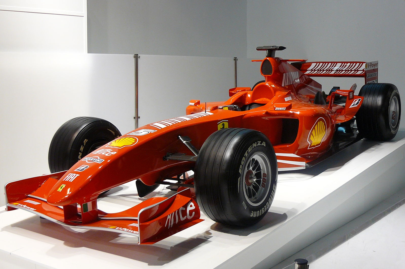
Image: ‘Xavigivax’ via Wikimedia Commons
Will Usherwood-Bliss gives his definitive list of the F1 2022 liveries
It’s the most wonderful time of the year – when F1 teams release their new cars for the season. This time is often filled with hype, especially in a year like this where the entire sport is getting a technical makeover.
Take a look on F1 Twitter, you’ll see endless comments about how Ferrari have used bird baths as side pods for more downforce, complicated chat about hot and cool air combining, how McLaren’s car is around 2cm longer than Aston Martin, and so on and so forth. It’s exciting to see how each team has interpreted these new regulations, but can also be rather tiring.
Tech not for you? Fair enough. There’s only so much talk about air ducts and the shape of wing mirrors that I can handle too. But fear not, there is an escape from the barrage of ‘who got it right’ arguments – the liveries.
Nearly every team has brought something new to the table this year – be it a colour change, a new sponsor, or a complete revamp. So, let’s go down the field, and rank every F1 livery for the 2022 season. Points given for originality and how cool they look on track.
1: Aston Martin
The second livery revealed this year, and in my opinion, the best looking. Gone is the BWT pink which seems to ruin anything it touches, and in is the modern and vibrant Aston Martin neon yellow. It really helps their car stand out, as last year it was easily mistaken on track for the Mercedes. But this year? I’m in love.
It’s what we all wanted from last year’s car, and I can’t wait to see it spun into the Azerbaijan barriers after a puncture. Some cars achieve their beauty through performance (McLaren Marlboro), others through pure looks (1991 Jordan), so here’s to hoping the Aston Martin can achieve the success their new look demands.
Alpha Tauri
I’ll admit, I was close to putting this first, and if I could tie them I would, but for the sake of rankings, the Aston just tops it. For the last two seasons Alpha have run their navy and white colour scheme on track, which has always been a hit with the fans. So, why is it ranked so high? Because they flipped the colours around. Easy change, huge results. The sleekness of the new cars works so well with the inverted colour scheme. Alpha Tauri’s design team, take a bow.
2: Ferrari
It’s not original, it’s not ground breaking, and they haven’t tried to be clever. But that is why it looks so good. With the return of Santander and the loss of Mission Winnow, the 2022 Ferrari livery is back to how it should be: red. The black rear and front wings remind me of the 1996 Ferrari F310, which also ran a plain red body with the black aero package. The F1-75 is what a Ferrari deserves to look like, its beauty is its simplicity. In fact, the only reason It isn’t ranked higher is because of the lack of originality, but given every Ferrari has been red (apart from that quirky blue phase) since the dawn of time, it would simply be too unfair on the others.
3: Williams
Dorilton Ventures. Brilliant at saving F1 teams from extinction, better at designing liveries. Last year’s car was fun – it was a throwback to their old yellow and blue championship phase, but it just wasn’t there both on track and in design. They tried to inspire the team, but failed. After the loss of the Martini sponsor, Williams seems to have been lacking in their design department recently, but they finally found the solution – make it blue. The Williams this year is modern and original, fingers crossed we get to see it on a podium rather than fighting for 9th.
4: Alfa Romeo
If anything, the Alfa livery is actually better looking than the Williams. But as I said, points for originality as well. The last few Alfa liveries have been great to watch on track – however, much like Alpha Tauri, the Switz team have kept the basic colours but worked them around to fit the new sleek design of the 2022 car. And they’ve done it brilliantly. The vibrant red back and front, the clean white stripe around the cockpit, it’s absolutely stunning. Another underrated feature of this livery is the removal of the Alfa logo at the back, replaced by the italicised ‘Alfa Romero’ – its beautifully Italian.
5: Mercedes
The Mercedes outfit have returned to their traditional Silver Arrows. It’s great to see the Petronas green return on the silver campus – but its just a bit dull. I was hoping for a bit of black in there, as the last two Mercedes liveries looked fantastic on track, but instead Mercedes have reverted to form. It looks cool, as it always does, and you could criticise me for not saying the same about the eternally red Ferrari, but the complete silver body doesn’t have the same iconic status. Mercedes tried adding something clever with the logos at the back, but it just looks a bit out of place. I’m not saying its bad, I’m just saying I had hoped for more.
6: McLaren
The McLaren by itself is a good looking car. I love the papaya that they’ve run with the last few years, and the blue really helps it pop. But when you compare it to the McLaren Shadow e-sports livery they revealed along with it, it makes me realise just what could’ve been. They’ve gone with the Ferrari route of taking their traditional colour and making It matte, which looks nice, but it’s just so orange. The sky blue is a nice touch, but that dark blue they ran with the last few seasons? I’m already missing it. Same with the Mercedes, I had hoped for more.
7: Alpine
Here’s where I start to get truly critical. I can’t stand BWT sponsorship. Any livery they touch loses its style. Racing Point looked like Peppa Pig on wheels. Aston Martin took a classic look and deprived us of the neon yellow. Alpine may as well be sponsored by Baskin Robbins. It could’ve been a lot worse, their season opener all pink livery is frightening to say the least, but compared with last year’s beautiful blue and red, it’s a downgrade. To conclude, BWT should not be near any livery.
8: Red Bull
I doubt I need to explain this. I get the whole idea of ‘don’t fix what isn’t broken’, but seriously? Take Ferrari and Mercedes – both have their iconic colours, but they change it up slightly every year. They bring something new to the table, and sometimes it works, and sometimes it doesn’t. Red Bull, on the other hand, decided they have such a good livery that they won’t even remotely change it. For the last six years, minus a few one off liveries, Red Bull have run the exact same design every season – not changing a single thing about it. Yes, since 2006 Red Bull have run the same basic concept, but I’m talking about the design team just copying and pasting here. It looks good, but that doesn’t mean you should keep it until the end of time.
9: Haas
TW: Russia-Ukraine Conflict
Now that Haas have officially parted ways with both Uralkali and Nikita Mazepin, we are yet to see the final edition of the Haas livery this year. On the third day of Barcelona testing, the American outfit ran an all white livery, which looked pretty clean. However, ranking an all white livery would seem a bit pointless, so let’s focus on that Uralkali livery for now. Regardless of the statement it brought with it, as a livery, it’s just boring. The all white body with the red and blue running down it is just ugly. I’d rather have them get sponsored by an obscure energy drink again than watch this car on track. The all-blue team kit is actually really nice, and I wish they capitalised on that more with the car. Although we are yet to see the final version of the Haas livery, they have never had much luck when it comes to the car design department. I pray for a return of the grey and red we saw in their early years, but until they finalise a title sponsor, I’m afraid we may be stuck with the all-white canvas car.
Special Mention: Alfa Romeo Camo Livery
It’s nothing new to see a team reveal a special testing livery – Red Bull often use this tactic to target fans like myself into thinking they’ve changed their livery for once. The only team to do so this year, however, has been Alfa Romeo. The one-off testing livery was…interesting? A fully black and white camouflage livery with barely any detail. Perhaps it was clever, it helps hide the technical changes they’ve made as the entire car is the same colour, but from a looks point of view, it just looked like a snow leopard. However, the merchandise they released on the side made it all worth it – I’ve already logged onto their shop to bag myself an Alfa camo hoodie using what little of my student loan I currently have remaining.