EXCLUSIVE: University of Exeter marketing team provides insight into new visual identity
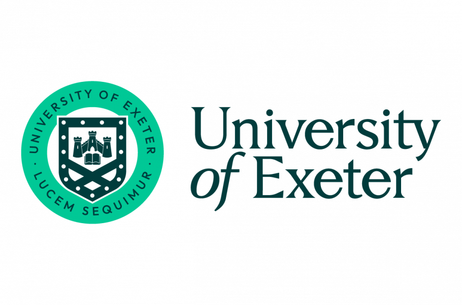
After 18 months of development, the University of Exeter unveiled its new logo and visual identity on 6 September 2022. The University’s marketing team gave Exeposé an exclusive insight into the rebranding process.
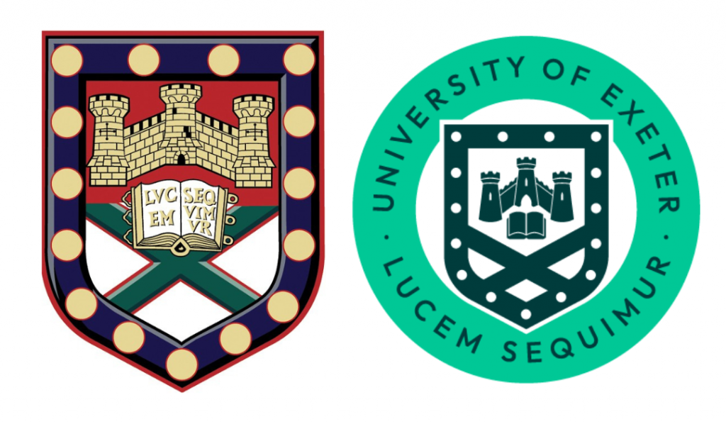
The old logo, containing a wordmark and blue swoosh, was designed in 2005. Jane Chafer, Executive Divisional Director of External Engagement and Global, explains that “it was not creating a sense of belonging or community for the University. It was looking very dated and was coming to the end of its useful life as an identity.”
The rebrand entered its initial stages in 2016, but started gaining momentum when Vice Chancellor Lisa Roberts joined the University. “We had a very clear sense of where we were going as an organisation and what we wanted to stand for,” Chafer continues, “but our visual identity just didn’t match.”
Furthermore, the old logo was not designed with social media or smartphones in mind, and so “it was starting to hold us back”, the team says. “The University is now printing less and less and we haven’t had a physical prospectus for three years – all open day invitations are sent electronically.”

Using community feedback
Feedback from staff, students and third parties was a guiding factor throughout the rebranding process. Chafer explains that “the new brand identity combines the features that our community felt most strongly about and we were determined that its development should be driven by consultation with and feedback from our students, staff and alumni as well as prospective students, business partners and key international stakeholders.
“Following the approach we used for the development of Strategy 2030 and the new Faculty structure, we involved members of our community throughout the process of developing the new brand and visual identity.” In May 2022, the team consulted more than 2,500 people (of which more than 1,000 were current undergraduate and postgraduate students from all campuses) during an in-person and online roadshow, as well as in focus groups.
We were determined that its development should be driven by consultation with and feedback from our students
Jane Chafer, Executive Divisional Director of External Engagement and Global
Surveys conducted in 2015 found that the old logo did not foster a sense of community or belonging. Then, throughout the consultation process earlier this year, respondents repeatedly emphasised that they wanted the new logo to have the University’s heritage at its forefront. “More than 70 per cent preferred the shield identities,” says Chafer, “and overall there was strong support for developing a visual identity based on our University crest […] to represent the heritage of the University in Devon and Cornwall. Students were particularly keen to see us return to using the colour green, with 66 per cent supporting green compared to 21 per cent supporting blue.”
A roundel that tells the University’s story
The new logo features a wordmark as well as a roundel, which can be used independently. The latter contains the University’s motto, Lucem Sequimur (we follow the light), in its lower half. “The motto feels both grounded in the history of the University and contemporary in what students and staff are doing now”, highlights Rob Mitchell, Assistant Director of Communications, “as it stays true to our current values of discovery, respect and excellence. It feels like a natural part in the new logo rather than being forced.”
Created in 1923, the traditional coat of arms predates the University, which was founded in 1955. It has since become one of the University’s key symbols, displayed on what students refer to as the ‘Exeter Rock’, as well as society-branded items that express affiliation with the University. The crest has been modernised to fit the University’s new look, but still showcases simplified versions of the Cornish bezants, Rougemont Castle, the Exeter Book and the Devon Saltire.
By featuring elements from Cornwall, Devon and Exeter, it unites the University of Exeter’s different communities under one logo. “What I like about it,” comments Chafer, “is that people can talk about the University’s history by just referencing what is on the crest.”
The wordmark’s font was changed following student feedback, as “there was a strong preference among students to have a more traditional Serif font to compliment the heritage nature of the crest” the marketing team explains.
Digital flexibility and accessibility
The logo’s signature accent green aims to make the University’s brand stand out among other Russell Group universities. The additional darker green and white make the design easy to read. “Accessibility is at the heart of the new brand identity.” the team emphasises. The University’s new typeface, called Outfit, is also accessible visually, as it is clear and modern, and digitally, as the Google font can be downloaded for free and works across different applications. “The new font compliments the more traditional Serif in the wordmark and has a future-facing, contemporary feel,” comments Lucie Burnett, Head of Campaigns.
When talking about using the new logo on social media, the marketing team highlighted its responsive nature, thus giving the University’s internal design team more flexibility. The crest’s shape can be deconstructed to place the subject matter at its heart so that people can “see things through the eyes of Exeter”. The bottom of the shield can also serve as a call to action in advertisements, explains the team: “We’re not going to run out of options with this brand, it really is future proof.”
The importance of sustainability
The new brand’s launch will initially be most prominent online, as the website will be reskinned and social media accounts will be updated. Burnett points out: “This is primarily a digital launch. We want to do this as sustainably as possible, from an environmental point of view and economical point of view as well. We are going to take our time with this and follow the principles that align with our strategy.”
An investigation conducted by Exeposé following the release of the University’s new brand concepts in June revealed that many students were concerned about having to change their society’s stash. The marketing team, however, highlights that they are “not putting a hard line down” as to when societies should start using the new logo. “For sports kits, we’re telling people to only phase [the new visual identity] in when you would be replacing your kit anyway.”
When asked about the University’s recent partnership with the Exeter Chiefs and their use of the old logo, the marketing team stated that the decision had to be made in March: “[at the time], we didn’t know what we were going to end up with.” The new logo, as a result, will feature on the Chiefs’ kit at the start of the next season.

Key signage relating to the University will be replaced immediately, but the marketing team noted that it would probably take between two to four years for the new brand to reach all parts of the University, particularly for big applications such as vans and large signage. “[Over the past 18 months] we have held off from doing some things.” Chafer noted. “For example, the sign at the bottom of campus has needed replacing for quite some time, but we thought we would wait until we had released the new visual identity to do it. We’re replacing things when they come to the end of their useful life instead of being wasteful to have the impact of launch.”